CLIENT Pink Fox Games - I’m one of the co-founders
URL https://happylittleplanet.com
INVOLVEMENT Head of Design, UX / UI design, graphic design
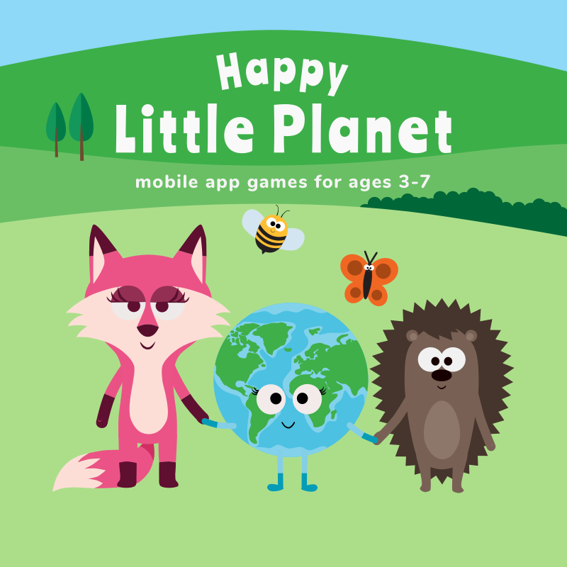
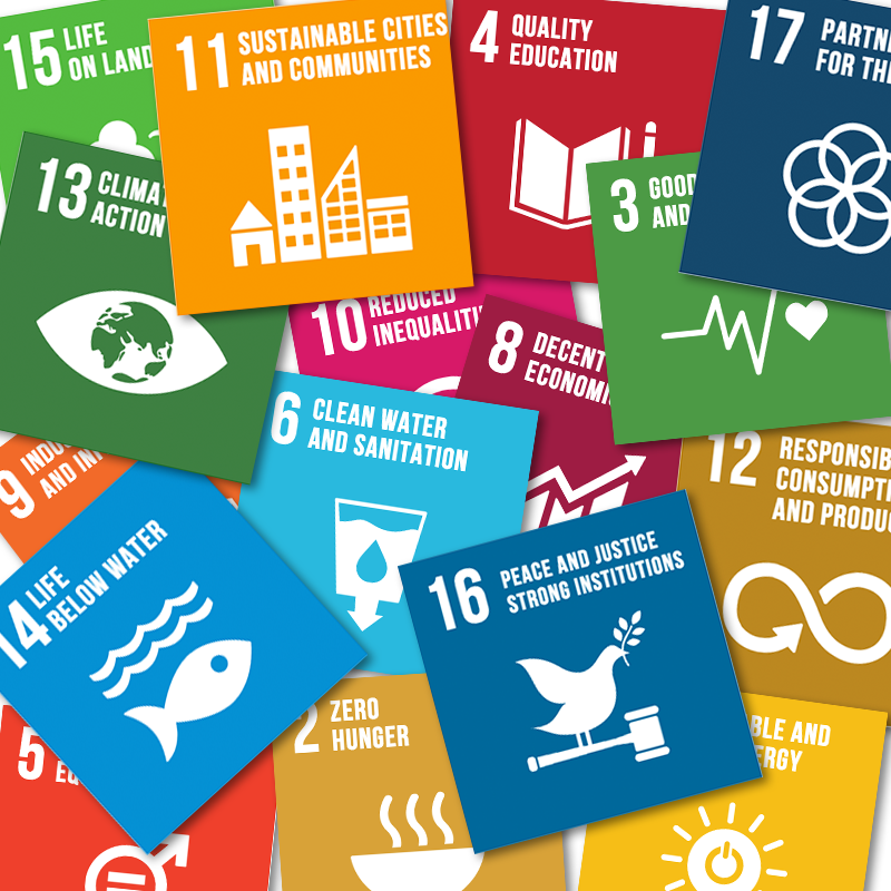
DESCRIPTION The Happy Little Planet app is a collection of single player role-playing open-ended educational games about cute animals, who are on a quest to save Lulu, the Little Planet, and make her happier. It is a mixture of life SIM and role-playing games and accompanying audio picture books teaching kids about sustainable life in a friendly and fun way. The core of the games is the 17 Sustainability Development Goals determined by the United Nations.
The Happy Little Planet app is created for individual use at home. It has already been downloaded over 22,000 times from the app stores in the US. Happy Little Planet helps make sustainability a part of the daily routine and thinking of the little ones.
The Happy Little Planet School is a platform designed for classroom use. It teaches kids how to take care of each other and the planet through diverse and fun digital and non-digital activities. The students love the entertaining classes with Lulu and her cute friends, and teachers enjoy teaching with the help of the detailed guides provided for them.
My responsibilities were as a digital product designer to create the Happy Little Planet world, set the overall design guidelines, take an active part in the ideation process, design the games, books, the school platform, guide the other members of the design team, oversee developers and make sure that everything including the advertising and other communication materials are coherently following the design guidelines.
I also took a leading role in the cooperation with the early childhood experts to create activities included in the Happy Little Planet School platform. I created the platform on Squarespace with excessive HTML and CSS coding.
CHALLENGES
We faced some interesting challenges from the very beginning of the project. One of the most difficult tasks was to turn the serious Sustainability Development Goals into enjoyable games for 3 to 7 year-old children with hidden educational intentions. We spent many hours of painstaking brainstorming and ideation and we could manage to break down the SDGs into smaller understandable bits for our young audience and we came up with nearly 100 game ideas.
The next challenge was to turn these game ideas into actual games with proper game-flow and UX but still stay educational and true to the particular SDG the game was about. This responsibility was mostly mine to come up with a step-by-step plan for the games we developed in the end. I took care to make the flow of the game smooth and enjoyable and meaningful at the same time by breaking the game idea into small actions leading towards the final goal. As kids are big explorers I hid some easter eggs for the beloved surprise element.
It was also a challenge to create such an intuitive interface for the app and the games that kids can explore and find out how it works without the help of an adult and without the ability to read. We decided to use no text for the parts kids had access to instead big size basic signs like arrows which are common sense even for this age group.
These are the main characters in the Happy Little Planet application. I designed all of the characters except for Magnus, the baby dino.
Currently there are 5 main games in the application each dealing with one particular Sustainability Development Goal of the UN. Happy Moves - SDG3, Switch Off - SDG7, Clean Hands - SDG6, Plant a Tree - SDG15 and Time Machine - SDG12
I was actively taking part in the ideation process and working out the game play. My responsibilities were also to design the games and almost all of their assets and prepare all the materials for development.
All the Happy Little Buddies have their hobbies and professions. In the mini games kids can get to know more about each professions or hobbies through dressing the characters up.
Designing and writing the copy for our website was also my duty. The aim was to give back the fun and engaging look and style of the games in the app.
Page 1: home page of the HLP School platform, a catalogue of digital and non-digital activities about sustainability.
Page 2: A detailed info page of an activity for teachers.
Page 3: A collection of handouts and extra classroom materials.
CLIENT adelphi & BEE Environmental Communication
URL: https://shoring-up-stability.org/
INVOLVEMENT UX / UI design
DESCRIPTION adelphi is a leading independent think tank and public policy consultancy focusing on climate, environment and development. adelphi’s mission is to improve global governance through research, dialogue, and advising. The more than 200 staff provide high-quality interdisciplinary research, strategic policy analysis and advising, and corporate consulting. adelphi facilitates policy dialogue and provides training for public institutions and businesses worldwide, helping to build capacity for transformative change.
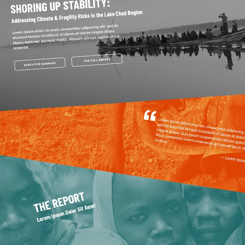
adelphi conducted an analysis of the Lake Chad region over tha past two years. They collected their findings in a more than 100 pages report entitled: SHORING UP STABILITY: Addressing Climate & Fragility Risks in the Lake Chad Region
Bee Communication was already working on the design of the report when I became part of their team to design the UX & UI of the corresponding website with the aim of presenting online the whole report and the most important findings as well as the team members. Throughout the designing process I had to follow the strict design guidelines of the print version of the report and keep in mind to select and work with such proprietary photos and effects that well reflect the atmosphere of the region and the seriousness of the report, however give back the liveliness of the people and the culture of the region. One of the main focuses was to end up with an enjoyable online reading experience for the users on all devices by providing an extract and summary of the most important parts of the report besides being able to read the full report too.
“Lake Chad is caught in a conflict trap. Violence between armed opposition groups – including the so-called ‘Islamic State West Africa Province’ and ‘Boko Haram’ – and state security forces has left 10.7 million people in need of humanitarian assistance. Climate change is compounding these challenges. This report identifies key risks and proposes pragmatic solutions to shore up stability in the region. [ … ]
This report is the first of its kind on the Lake Chad region and a pioneer among climate-fragility risk assessments globally. It is the product of an intensive two-year period of research across all four countries. The assessment draws on long-term hydrological data from the Lake Chad basin, including ground measurements as well as brand new analysis of 20 years of satellite observations. It also builds on more than 200 interviews with community members, including past and present members of armed opposition groups, experts and officials, and an extensive review of the literature on Lake Chad. It aims to present a balanced, fact-driven conflict and climate risk assessment of the Lake Chad region that identifies key risks and proposes pragmatic solutions.” Source: adelphi
CLIENT EDUardo Plc.
URL https://edu-simulation.com/
INVOLVEMENT redesign, UX/UI design
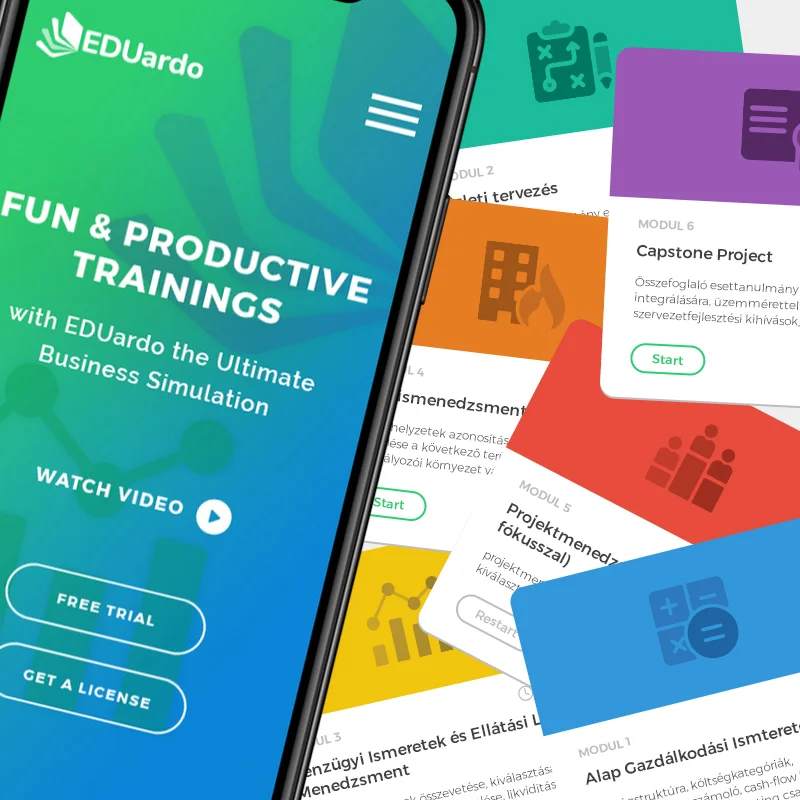
DESCRIPTION Eduardo is an online multi-purpose business simulation software designed for students of economics, employees in the business sector and trainers to learn/teach and practice business skills in ready-made market scenarios.
EDUardo Plc. approached me to redesign the style and structure of the user interface of the Eduardo software to make it more user-friendly and up-to-date in design and to create a new landing page. My task was to create a fresh, modern and young look for the software by redesigning the overall style of the user-interface as well as rethink the structure to achieve a user-friendly tool. The software got a new look according to the new style guide (new colors, typography, shapes, icons, etc.). The user interface needed a major rework to make it more intuitive and create flawless user-flows. Some sections logically belonging together were put on one screen ready to be used without having to look for the side navigation and get lost among the menu points while playing the simulation. The main navigation on the left side was also simplified and the categories regroupped to maximize space and user speed, whereas some important information, for example, the status of the user in the simulation, the amount of cash available, profit realized in each round, etc. were put to the main bar to always have them at hand.
CLIENT The International Institute for Sustainable Development (IISD) and BEE Environmental Communication
URL https://sustainable-development-goals.iisd.org/country-data
INVOLVEMENT The International Institute for Sustainable Development (IISD) promotes human development and environmental sustainability through innovative research, engagement and partnerships. One of the main focuses of IISD is the Sustainable Development Goals (SDGs). To provide information and analysis of the United Nations’ 2030 Agenda for Sustainable Development (including the 17 SDGs) IISD operates an SDG Knowledge Hub, which is an online resource centre for news and commentary on the implementation of UN’s Agenda.
The 17 globally agreed goals of the Agenda have currently all together 240 indicators. This is a massive amount of data that is growing every year. IISD contacted BEE Environmental Communication to create such an easy-to-use online tool that visualises this vast amount of data in a simple, searchable way. I was asked to be part of the BEE team. My responsibility was UX design, I was part of the BEE team to add my UX knowledge and experience to create the tool that besides it is ultimately user-friendly, it lets the users search the dataset on mobile phones too. The amount of data and the table formats we had to use to show certain data meant real UX challenges while creating the structure and designing the wireframes but in the end we could manage to come up with a solution that has been very well received by many users working in this field.
Desktop, tablet and mobile views
Users can check how many indicators of each of the 17 SDGs were reported by the countries in the dataset, i.e. how popular the indicators were on a 0 to 100% scale. As the mobile phone view is too narrow to view the table of the indicators (some of the indicators have way too long names) site visitors are asked to turn their phone to landscape view when the table appears, so nothing is left out for the mobile users.
The portal enables users to drill further down in the vas amount of data by country.
CLIENT The British Embassy in Budapest
INVOLVEMENT creative concept development / graphic design / web design (done as a designer at chili)
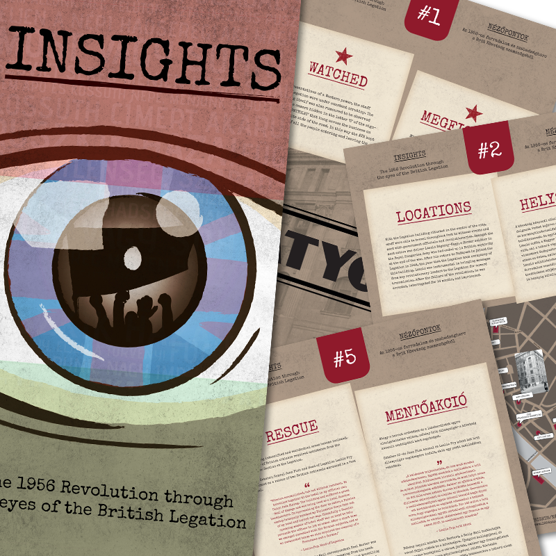
DESCRIPTION The 60th anniversary of the 1956 Revolution in Hungary was celebrated in 2016. The British Embassy was already present at the early '50s in Budapest (as the British Legation). The employees both British and Hungarians were working together to inform the West and help the British citizens stranded in Hungary. The Embassy has a vast amount of historical material as the Head of Legation kept in touch with Britain via telegrams. Our task was to present the historical events in a unique and engaging way. As the 1956 Revolution is very well documented and often commemorated historical event, it was important to come up with a new and different presentation.
The core idea was to show the events through the eyes of the British Legation with a modern twist to it. Together with the team of the Embassy we decided to use a timeline where the main characters of the Legation unfold the story by posting their comments to the timeline about the events of the day. To make the timeline more interesting, we created videos together with the British Embassy’s current ambassador and employees.
TESTIMONIAL “The British Embassy commissioned Chili’s team to produce the creative design and website for our project to commemorate colleagues who worked in Budapest during the 1956 Revolution. The team responded with enthusiasm, proactivity and a determination to really understand our needs. They went the extra mile to ensure an excellent end product within a very challenging timetable.”
- Ben Luckock, Head of Policy Team, British Embassy Budapest
The website was available until mid-2017.
The timeline of the '56 events was created as a responsive website to enjoy the content on mobile devices too.
Invitation to the exhibition at the British Embassy
1 of 10, size: 70 x 100 cm
2 of 10, size: 70 x 100 cm
CLIENT Agriapipe Ltd
URL: https://greencity.agriapipe.com/
INVOLVEMENT UX / UI design, UI copy writing, creative planning
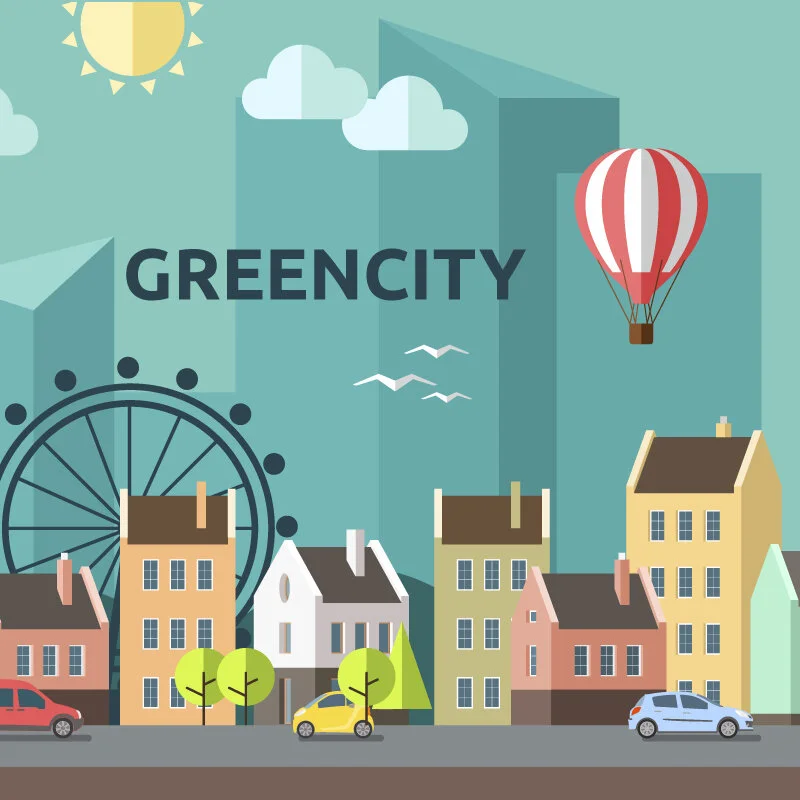
DESCRIPTION Greencity was created as a promotional tool for Agriapipe to help the future introduction of a carbon calculator in the field of trenchless pipe renovations to enhance the crusade against global warming. The web application was first shown on the European Water Summit in Budapest in 2019.
I was responsible for coming up with an idea how to promote the future carbon calculator software, design the system and its graphical user interface. The idea was to create such a tool that playfully engages the decision makers of public utility companies to show them what great effect they can have on the environment by choosing the right or wrong technologies for pipe renovation too.
Greencity shows the engineers the biggest advantages of trenchless technologies compared to the traditional digging methods in an entertaining way:
The user of the website transforms into a leader of the city, who has to do something about the deterioration of pipelines running under the streets and houses. The site takes the user through the different decision making points such a leader has to take giving all the possible technology types to be used for renewing the pipe systems (potable water, sewer and gas pipelines).
After the renovation is done with the chosen method, all the relevant data appear on the screen together with a comparison to the traditional digging method (or vica versa) clearly showing the advantages of trenchless methods over the old digging processes with special relations to environmental protection, for example, how much carbon dioxide was not emitted with the chosen method.
At the end of each renovation cycle the user is given a question whether he knows what the amount of not emitted carbon dioxide means, for example, how many times a plane would cross the Equator. As the app was used at the European Water Summit, those who were able to give the right answer, received some gifts from the company.
SCREEN 1: The user has to choose which type of pipeline s/he wants to renovate.
SCREEN 2: The technology has to be selected.
SCREEN 3: By clicking the ‘Read More’ button next to each technology a pop-up window appears with photos, videos and description of each technology.
SCREEN 4: The progress bar shows the status of the renovation.
CLIENT NRG Report
INVOLVEMENT UI design, logo & identity design
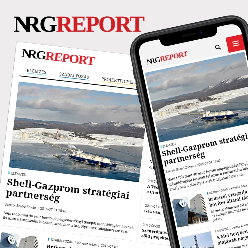
DESCRIPTION NRGREPORT over the past years grew to be one of the biggest newsportals operating in Hungary exclusively dealing with the energy sector. As a UI designer I was part of the team that created this portal. It was a great experience and an exciting challenge as well to design such a portal from scratch.
The core focus of NRGREPORT is to stand out as a professional, indipendent and serious online newsportal of the energy industry. This defines what the brand stands for: ensure objectivity and credibility for all the readers and act as a firm and unquestionable source of reliable information.
Throughout the designing process the aim was to create such an appearance that clearly reflects and communicates the values and messages of NRGREPORT. Keeping the interface simple but elegant and above all user-friendly and accessible on all devices was a key concept from the very start as well as evoking the real newspaper-like feeling in the readers as they immerse in the vast amount of content.
LOGO DESIGN The slightly modified serif font used for the logo is elegant and serious, truly represents the NRGREPORT brand that is a trustworthy and serious source of news from the energy industry. The font’s wide stems create stability and evoke trust, the serifs give elegance, while the wide and round characters make the typeface dynamic enough for a news portal.
The first two letters of the logo has been modified in order to create a symbol that is at the same time an integral part of the logo not bothering readability and a separate glyph to identify the NRGREPORT brand in signatures or watermarks. The letters ‘N’ and ‘R’ in the glyph are also the initials of NRGREPORT where ‘N’ stands for NRG and ‘R’ for Report.
CLIENT BCA Ltd
URL: https://bca.hu
INVOLVEMENT UX / UI design
DESCRIPTION BCA Ltd is a team of enthusiastic consultants and developers. That is why I’d always looked at this project as a great challenge. Designing a website for a bunch of experts in the field feels good and a real challenge at the same time. :)
BCA needed a new and fresh website with a completely new concept in the background. When they contacted me they’d already said farewell to another company that couldn’t deliver what they expected and they already had an almost ready design in InVision. Getting into a project at such a stage is on the one hand, good because the client already has done a lot of thinking and researching and on the other hand, difficult as they’ve tried and disliked a lot of options already.
I was motivated to bring them the solution.
The two main tasks were to change the past concept of Consultant to Client approach in the communication to HR focused to promote the company to get new and fresh minds from the universities attracted to work there. This was a radical change that affected all areas of the website from structure and design through body copy to images.
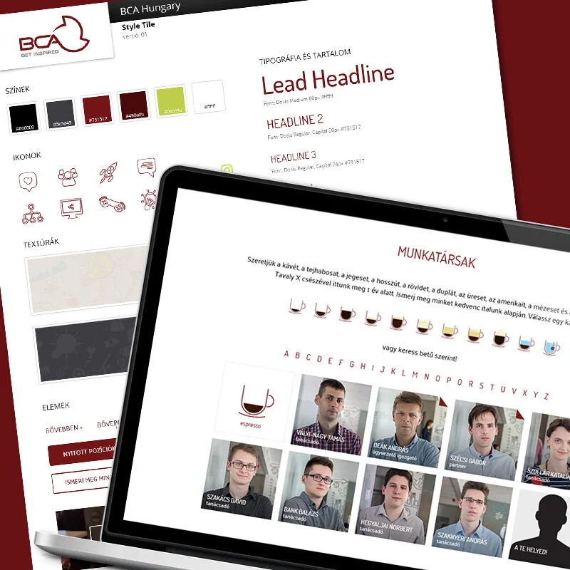
The other bigger task was to show all the colleagues in one page and yet keep the page clean and short, especially in the case of mobile devices. BCA has over 70 employees. The solution is something that I’m really proud of because it fits the requirements on many levels: it is young and cool, shows office life and keeps the mobile pages still easily scrollable. The idea hit me when we were talking about with BCA the statistics of how much coffee they consume per year in the office. Man, they really love coffee!!!
So, the solution was to group people according to their coffee preferences, like this we could have smaller groups of latte people, flat white lovers, etc. The outcome is a clean and enjoyable collegue search tool that also tells more about the colleague. Users can also search among the colleagues according to the alphabet.
These factors and functionalities tirned the website into an HR promotional tool: fresh, young and techy look, cool office life images, information all about the company social life (teambuildings, office fun days, excursions, marathon together, etc.), career center with CV upload possibility and job advertisements.
CLIENT Colour Republic, USA
INVOLVEMENT graphic design / web design / web development project management
URL https://colourrepublic.com/
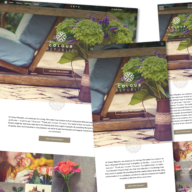
DESCRIPTION Colour Republic is a Miami based sales and complete flower service provider to mass-market customers all around the USA and Canada. They bring the beauty of Ecuador's flower fields to people in a completely new way: besides the outstanding quality and unique design the Colour Republic bouquets are 100% hand-tied, which gives a special personal touch to all the bunches they sell. They tie bouquets with the goal of giving an extra meaning to the different occasions in their customers' lives.
To showcase and promote their beautiful bouquets Colour Republic decided to further develop their website in 2 main phases. In the first and completed phase my responsibility was to design the new responsive website with all the functionalities to present their products in different categories. The aim was to achieve a simple and easy-to-use website both for the users and admins. My responsibilities were pointing beyond the mere design process. I also had to pay attention to manage the development team I was working with.
At the end of phase 1 the Client received an easy-to-use administration site through which the content can be fully managed by the Client himself. The website was created with a special emphasis on the easy management of bouquets and the flowers.
In the 2nd phase the website will be completed with an amazing all-about-flowers blog and a store locator. Currently, I’m busy with the design.
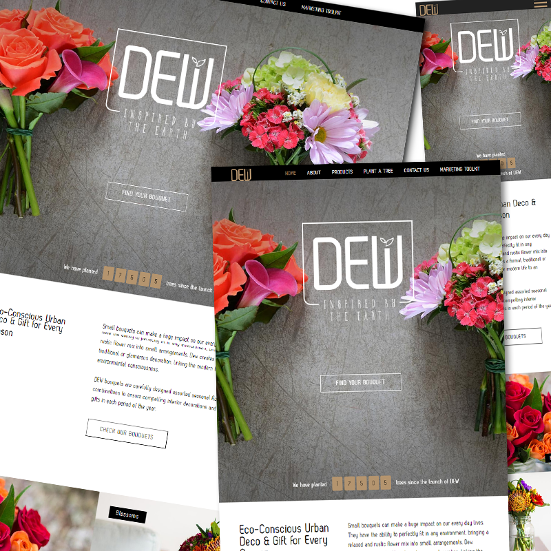
As first the DEW Collection website (DEW is a product family of Colour Republic) was created, it was important to design the new website that is somewhat resembling the design of the DEW page.
CLIENT Colour Republic, USA
INVOLVEMENT graphic design / web design (done as a designer at chili)
DESCRIPTION Colour Republic, a Miami based flower producer and wholesaler decided to conquer a new segment of the flower market and came up with the idea to sell 100% hand-made bouquets designed by a well-respected European designer is bigger supermarkets throughout the United States. Their very first such product line is called DEW Collections. To be able to give the necessary attention to the product line, the Client decided to create a separate website for DEW.
TESTIMONIAL “I worked with Chili Creative team developing the website of a new product line up. After successfully finishing the job, I can tell without a doubt that they were amazing partners. Besides the website having the highest UX level in the industry, the design was stunning. They consistently demonstrated high quality in their deliveries, paying close attention to details. The team clearly understood the importance of the project and could always keep commitments, making sure that assignments were delivered on time. For sure, I will recommend them for future developments in the company.”
- Wilson Calil, Marketing Director, Colour Republic
CLIENT Nouba Staffing Ltd
INVOLVEMENT design the website, business cards and the brochure (done as a designer at chili)
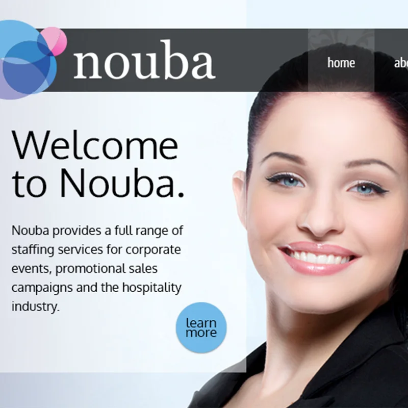
DESCRIPTION Nouba was a brand new company when we met. They were in need of such a website that differentiates and puts them ahead all their competitors. So during the design process the main focus on the one hand was on to create a site that shows the expertise and high quality of services Nouba is offering to their clients, on the other hand it was important to make Nouba attractive to young talents ready to work in the staffing business. Therefore, the website had to have such features too that enables the visitors to easily apply. Besides the website I was asked to design the business cards and the 16-page A5 landscape cut brochure too. The photos were taken by my friend, Bence Bársony.
16 pages, A5 landscape cut
CLIENT Bence Bársony Photography
INVOLVEMENT graphic and web design / html5 / css3 (done as a designer at chili)
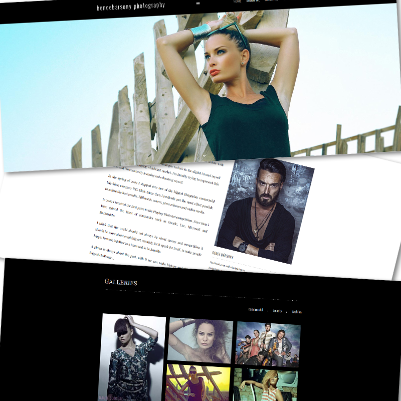
DESCRIPTION This was one of the first website that after I designed it, I myself created the HTML and CSS codes. I designed this website for a friend with whom I'm also working on different projects. The aim was to create such a portfolio site that truly reflects Bence's taste and personality and showcases his work in an elegant way. This website is my very first responsive website that I coded right after finishing the web designer course. At the time of building the site I'd heard about Bootstrap and other responsive solutions but I didn't know how to implement them, so all the break points and the responsiveness of the website had to be set by hand. Even though it was a painstaking task to do, I enjoyed every minute of it. All the images on the website are optimised for retina display.
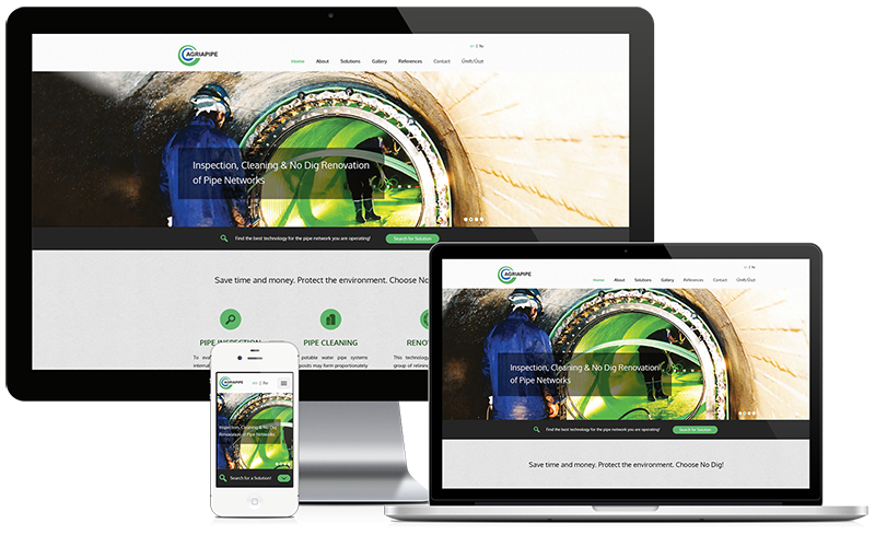
CLIENT AGRIAPIPE Ltd
URL http://agriapipe.com
INVOLVEMENT branding / graphic design - logo, website, business cards, brochure (done as a designer at chili)
DESCRIPTION Agriapipe is a construction company offering trenchless renovation of pipelines (potable water, sewage, gas, oil, etc.) and pipe cleaning in Hungary and worldwide. The company has already been for over a decade on the market and needed a new and more informative website. As there was a great shift in communication towards emphasising the green aspects of the technologies the company uses, the CI colours had to be reconsidered, more content was created and to make it easier for the site visitors to look for the suitable pipe renovation technology a technology search tool was designed and integrated into the website. The complex multilayered menu structure of the website was a real UX challenge to keep it as simple and easy-to-use as possible but with a fun dashboard, the sub-menu system and the floating side bar on subpages we could manage to overcome this obstacle. Besides creating the website design, I had the task to design the logo, the business cards and the brochure too.
LOGO DESIGN the two curly lines represent a pipe renovated by a No-Dig pipe rehabilitation technology: a liner within the host pipe (green pipe: host pipe, blue pipe: liner) / the colours of the logo are blue and green, where blue stands for water and gas - the two main business fields of the client - and green is used for the environment / the round edged logotype is used to resemble pipes
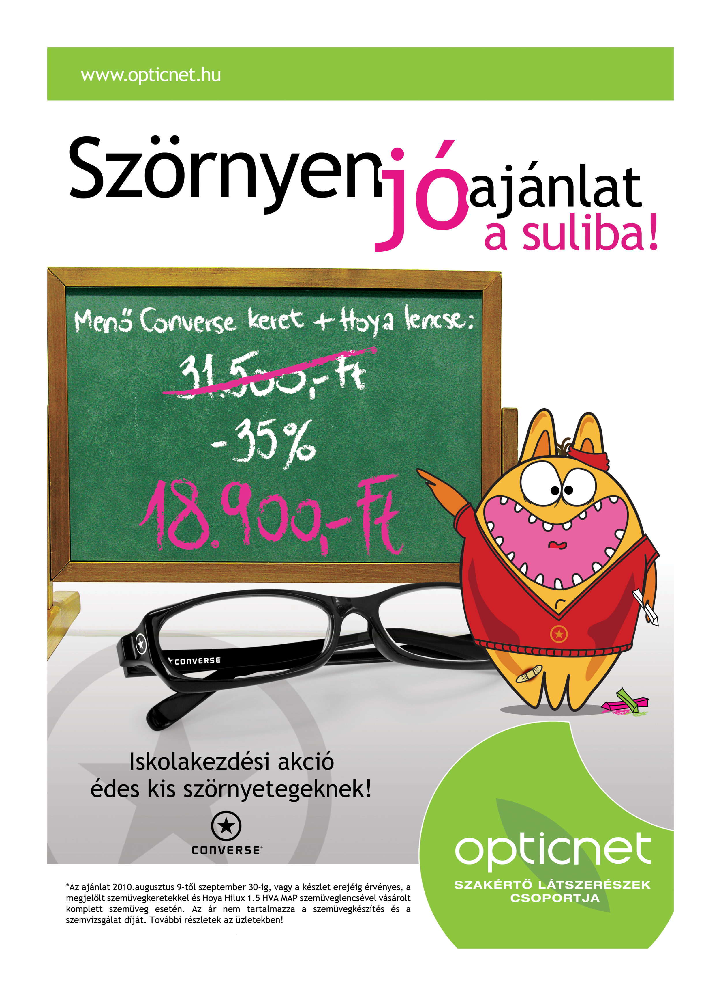
CLIENT Opticnet Hungary
INVOLVEMENT develop creative concept / graphic design / copy writing (done as a designer at chili)
DESCRIPTION As the beginning of the school year was approaching Converse together with Opticnet released a campaign to show school kids that wearing glasses can be cool in case they wear the right frames. Our tasks were to develop the creative concept for the campaign, design the B1 size poster, flyer and other marketing materials necessary for the campaign. With my copy writer colleague we decided to catch the attention of the school kids with a cute and loveable creature that wears a pair of cool Converse glasses (that was the product to be promoted) showing that wearing glasses is more a matter of coolness then being in the focus for mocking. We came up with several different ideas to approach this idea, and as the target group was wide range and included the younger representatives of the teenagers, together with the Client we voted for the cute monster. The adorable mascot impersonates the little rascals (the little monsters) of the school grounds. Originally the monster was wearing a pair of Converse glasses but the Client decided to take it off of the mascot.
ELEMENTS OF THE PROJECT cute monster, the mascot / B1 poster / flyers distributed in the shops and the stickers for the shop windows / headline and the body copy for the poster and the flyers
For some years I was designing the invitation cards and posters for the communication department at RTL Klub, the leading commercial tv channel in Hungary. The department regularly organised press conferences on the coming shows and events.
My task was to create the key visuals and design the invitation cards that were later used as posters at the press conferences.
The first one was created for a press event on the shows coming in autumn, such as I'm A Celebrity Get Me Out Of Here and a dancing show also with celebrities. The main title's translation is "What you'll need in autumn".
The second poster was made for a fun behind-the-scenes event organised for the journalist, where the guests took part in a whole day tour around the studios and most interesting places at RTL Klub.
Amire összel szükséged lesz - What You'll Need in Autumn
Sajtótúra az RTL Klubnál - Press Tour at RTL Klub
Quiz show 'Fogd a pénzt és fuss!'
Quiz show 'Póker Arc' - Pokerface

"The British Embassy commissioned Chili’s team to produce the creative design and website for our project to commemorate colleagues who worked in Budapest during the 1956 Revolution. The team responded with enthusiasm, proactivity and a determination to really understand our needs. They went the extra mile to ensure an excellent end product within a very challenging timetable."
- Ben Luckock, Head of Policy Team, British Embassy Budapest

“I worked with Chili Creative team developing the website of a new product line up. After successfully finishing the job, I can tell without a doubt that they were amazing partners. Besides the website having the highest UX level in the industry, the design was stunning. They consistently demonstrated high quality in their deliveries, paying close attention to details. The team clearly understood the importance of the project and could always keep commitments, making sure that assignments were delivered on time. For sure, I will recommend them for future developments in the company.”
- Wilson Calil, Marketing Director, Colour Republic, Miami